
Universal Smash 106 by ZenkaiPawa
Id just like to mention, my snake and fox doodle along with one of my first zedur comics now have over 100 likes. Go me. WOOT.
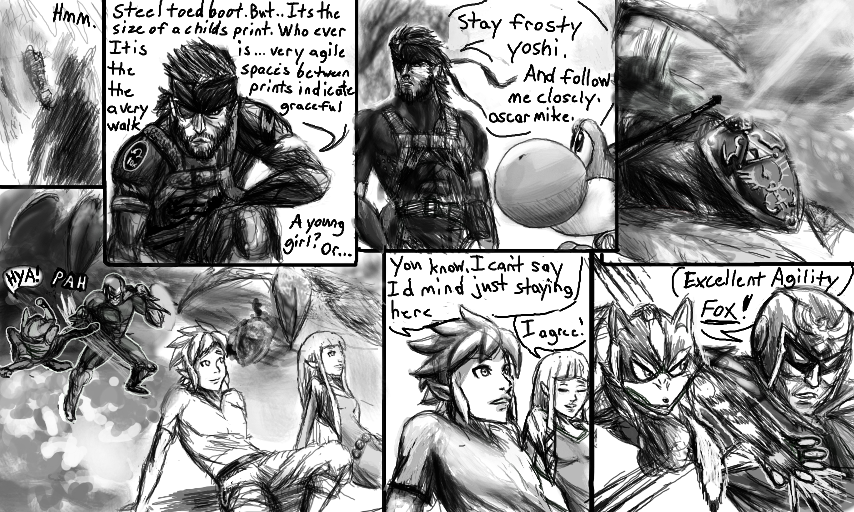
Stay frosty oscar mike
#stayfrosty #zelda #mgs #snake #yoshi #link #captainfalcon #fox #universalsmash #smashbros
Comments
9+
like
reference image
eraser
eyedropper
time taken
nsfw
flip
undo
paint with friends
private
used tools icons
500
100
25
5
1
The comment has been reported
The Colors! Gallery moderators will look at it as soon as possible.
delete comment?
just delete
delete comment and prevent this user from commenting on your paintings
report as inappropriate
confirm
Comments
05 Oct, 2013, 4:39 pm
mhm hhhhhh, dat shadow thou
05 Oct, 2013, 4:47 pm
You did great on the 4th pannel and the comic.
05 Oct, 2013, 5:19 pm
I should read all of these sometime
05 Oct, 2013, 5:41 pm
link isnt wearing his tunic XD
05 Oct, 2013, 6:19 pm
Comic looks great im taking a break from mine. xD
05 Oct, 2013, 7:43 pm
Wow, the top right panel is beautiful! Such a kewl scene :3
06 Oct, 2013, 2:54 am
Wanna see my new #Pokemon pic? #WiccanStar said I can have #Whispen in my series.
06 Oct, 2013, 3:22 am
I love how you tossed in an Oscar Mike. what does it mean again?
06 Oct, 2013, 4:23 pm
on the move I believe. So it can mean Lessgo too.
06 Oct, 2013, 4:33 pm
Heh,yep!BTW,saw Pokemon Origin on Youtube,a 4 episode series,and it is far better than the original series altogether!I highly recomend even non fans to see it!
06 Oct, 2013, 4:37 pm
Im so gonna see dat shiz. Red is the bomb.
06 Oct, 2013, 5:31 pm
Nice page, but the panel design of being cut nearly in half horizontally is kind of boring.
You need to practice paneling more.
06 Oct, 2013, 6:29 pm
Thats pretty much true. I realized half way through it looked kinda safe, thats why i opted for the very large 5th panel look. Hows about 2 pages back? I tried experimenting more. Part of the challenge now is making this work horizintally, as the landscape canvas guves me SOOO much more room fersus the portrait, and i can pack more into a page this way, i think it makes it more fun to read from page to page due to my followers having to wait for what happens next,
other wise if i had kept it the vertical traditional way. itd make it kinda tedious to follow, thats part of why I used to have a 2-3 page quota for each day. Which didnt always look too great.
12 Oct, 2013, 1:22 pm
You mean the one where Snake talks about being eaten alive by Yoshi, right?
It's pretty good, but the top right part is a little off-putting.
You used Snake's head floating over your final panel as your third panel, and it creates some problems.
Normally when you use a layout like that one, the entire left side (all of the small panels) would be read, then you'd move on to the large single panel on the right.
Snake's head floating over the panel suggests that he's thinking in that panel in particular.
By not making a barrier of sorts (probably a panel wall, but an imaginitive mind could come up with something else) between the top-right and bottom-right you've accidentally con.nected (these sensors are driving me crazy) them, wich in turn makes the page harder to read.
15 Oct, 2013, 5:28 am
I getcha, I was experimenting and wondered. Yeah the censors are a tad much.