
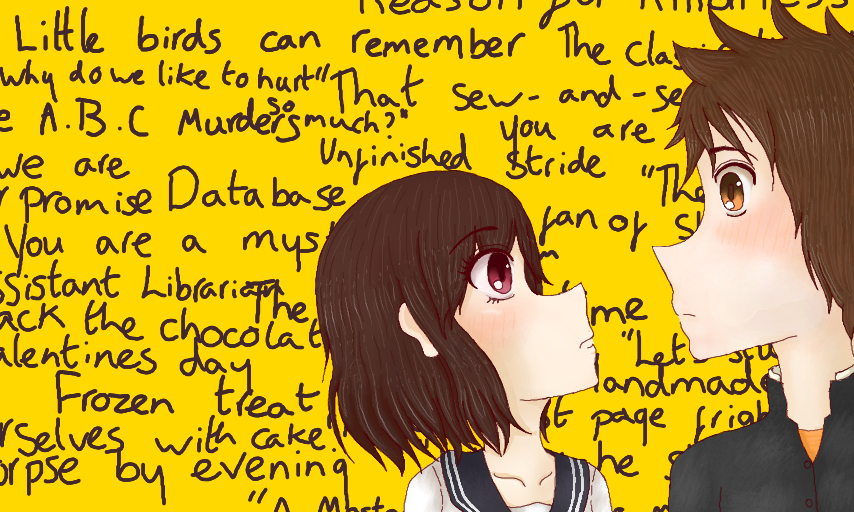
Darling, We Can't Escape by BeccaGurl
Version 2 of my OTP fanart~ It's more complex~ They're such cuties~
Critique welcome
This is the first time I've drawn either characters that well :3 I find all the kotenbu cuties hard to draw apart from Oreki. I changed Mayaka's hair up a bit and idek how Satoshi looks good.
#otp #hyouka
I think this is the best work in my gallery. -little bit disappointed that it has no comments-
Comments
3
like
reference image
eraser
eyedropper
time taken
nsfw
flip
undo
paint with friends
private
used tools icons
500
100
25
5
1
The comment has been reported
The Colors! Gallery moderators will look at it as soon as possible.
delete comment?
just delete
delete comment and prevent this user from commenting on your paintings
report as inappropriate
confirm
Comments
29 Sep, 2013, 6:14 pm
2 questions:
What´s the meaning of #otp ??
Are you sure that critiques are welcome ?? XDDD I can be a little hard with critiques XD
Anyway thanks for your comment on my last picture !! ;)
29 Sep, 2013, 11:21 pm
CRITIQUE:
Good:
- The faces expressions each other
- The polished and thin lines
Weird ?:
- The hairs have the distance of shades and lights very equal each other
- The mouths are very long, i understand that drawing faces sideway is difficult
- The heads are maybe a little big
- The characters appears a little hide in the corner leaving a lot of space in the opposite corner, i know tha you want to show the text but you can do it a little more small in an elegant drawed paper
- Very simple background with only one color and the text
- The ear should be on a more down possition
Tips to improve: (for future drawings)
- Use a little more unequal distances and sizes on the hairing shading and lights and do these lights more strong and add to the lights a blur layer of white to do an effect of more blur shine
- Correct the proportions of mouths, ears, heads... Ussualy a normal teenager manga body sizes 6 or 7 heads
- Try that the ocs gain leadership doing them more big on the screen (except if you want to show other thing more important than them)
- Avoid one color backgrounds, idk, try with acid or pastel colors combinations or a landscape
- Use more strong shading and you can do it with the color theory of colors that are very near each other on the wheel, example: Brown hair with a little more red and dark shading and a little more yellow and light shines (more details on my manga coloring tutorial)
- Try better calligraphy with the text to do more readable and beautiful to the view and put it for example into a paper with a light of a window illuminating it
- Move the 3D layer of the ocs more near of the screen or slow a little more the slider because when the scene contains too few elements is better don´t use too deep 3D to don´t displease the view. More deep is for more elements layers and a landscape for example
Well... thats all that i can see in a quick view and my english is probably very poor, so, sorry XD
I hope that was useful :)
30 Sep, 2013, 5:55 am
Thank you for comment!!
Pretty?Thank you!!