
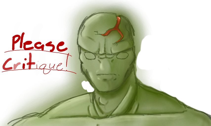
Unfinished by NathanG.
Hey! I am working on this drawing, and i would like to know how to make it better for the final product (lighting). Please critique, thanks!
Comments
4
like
reference image
eraser
eyedropper
time taken
nsfw
flip
undo
paint with friends
private
used tools icons
500
100
25
5
1
The comment has been reported
The Colors! Gallery moderators will look at it as soon as possible.
delete comment?
just delete
delete comment and prevent this user from commenting on your paintings
report as inappropriate
confirm
Comments
13 May, 2012, 1:18 am
I like the composition here so far, make sure to make the bg compliment the dude in the front.
I would say that your lighting and color usage falls into a very common trap: you use a lighter and darker shade of the object's base color for your shadows and highlights. Unless the object is in a completely light-neutral surrounding, highlights and shadows usually have a different shade/color from their base object. Color theory is your friend here, study it! The anatomy and lighting themselves are fine, but you should try to increase the contrast between the shadows and highlights to really make your image pop!
13 May, 2012, 1:23 am
Oh and also; try to start your drawings by putting a neutral color as a background. Using pure white will mess up your sense of contrast. Also, study objects, people and anatomy from real life LOTS. If you have a good understanding of construction and anatomy, you will know if you need to change something!
13 May, 2012, 1:25 am
Although I'm in baby shoes myself, you could check out my gallery to see what I mean about using different shades and colors in lighting.
15 May, 2012, 2:58 am
its a nice blending style its good enough