
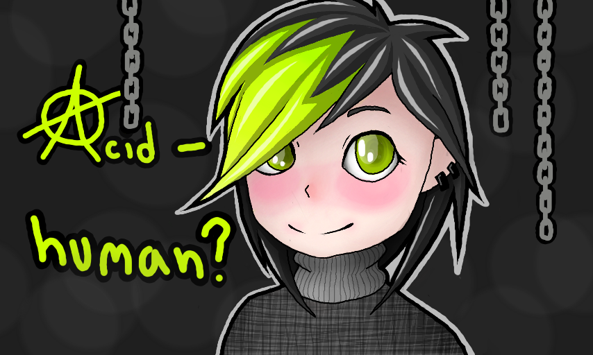
XC by AcidWolf
As you all know I dont draw humans often, if ever. Im trying to learn but I just can't! If anyone could please critique this and tell me whats wrong with it and how I could improve I would apriciate it. This is probbaly the best human ive drawn but im still not happy with it. Any sugestions?
Comments
9+
like
reference image
eraser
eyedropper
time taken
nsfw
flip
undo
paint with friends
private
used tools icons
500
100
25
5
1
The comment has been reported
The Colors! Gallery moderators will look at it as soon as possible.
delete comment?
just delete
delete comment and prevent this user from commenting on your paintings
report as inappropriate
confirm
Comments
10 Aug, 2013, 12:07 am
It looks perfect, you did well :)
10 Aug, 2013, 12:11 am
This is really really good u v u If you are going for a cartoony style this is perfect. If you want it to be a more realistic-y cartoon you should make the nose and eyebrows bigger and make the eyes smaller. But it looks fantastic as it is, and I don't think you should change anything ^^
10 Aug, 2013, 12:12 am
i do draw humans, so here is some cunstructive critique:
the head shouldn't be too big. the shoulders should well expand pass the earlobs. the hight of the head should be large. when drawing hair, don't be afraid to add detail. it shouldnt look like 5 locks of hair, unless completely intended. and always make the chin soft. you dont want the lines too sharp or else it'll look completely fake, even if its a cartoon.
hope that helps! :)
10 Aug, 2013, 12:13 am
height of head should NOT be too large***
10 Aug, 2013, 12:13 am
i find it butiful...i hate nothing in this o3o its amazingly nice!
10 Aug, 2013, 12:41 am
I think this looks great if you are going for more of a chibi style! The placement/anatomy looks good. If you want it more realistic make the chin ever so slightly bigger, make the nose closer to the mouth but not too much, make the eyes and mouth a lot smaller. The shoulders look very chibi too, just make them larger and to prevent anything from being too big or too small, try sketching people's faces and look at yourself in the mirror :) Remember, practice makes perfect, you really can't hear that enough XD
10 Aug, 2013, 12:43 am
^^^what livelife said^^^
10 Aug, 2013, 1:28 am
This looks adorable! If you're going for the chibi look it's perfect and it's 100 times better than how I draw people
10 Aug, 2013, 1:48 am
Whats wrong with it?
absolutely nothing.
10 Aug, 2013, 1:49 am
Oh wow this is amazing Acid!
Do you think you can enter my contest? The cover of it is purple and black. :)
10 Aug, 2013, 2:06 am
for a cartoon like style like this is, its wonderful! :D and for more realalistic i suggest the eyebrows be a tad bigger and the shoulders should be a little wider. but it dose look absolutely splendid as it is :D
10 Aug, 2013, 3:12 am
Chibi Acid equals Epicness!
10 Aug, 2013, 4:42 am
i dont see anything wrong, and im not just being nice, i seriously dont see any errors
12 Aug, 2013, 9:01 am
If that OC looks anything like you,you are cuuuuuuuuuuuuuuuuuuuuuute!!
28 Aug, 2013, 2:38 pm
it looks really good, Acid.
27 Nov, 2013, 8:00 pm
I agree with that guy ^
26 Sep, 2014, 1:17 pm
that's awesome! :D