
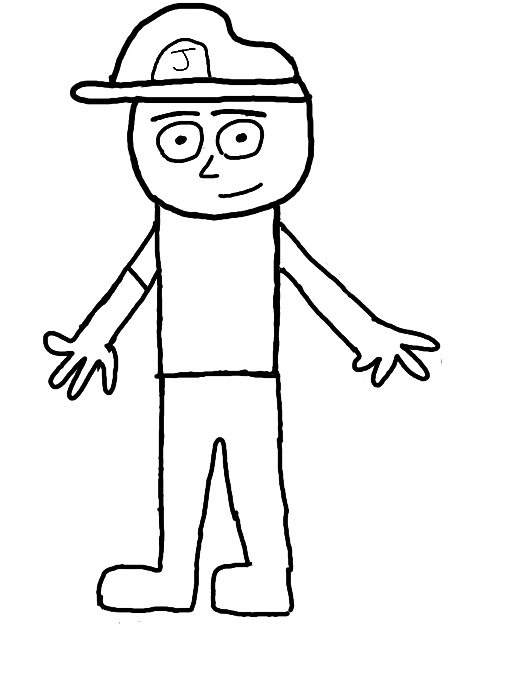
Realistic Joe by EbolaGW
The human version of my personal character, Joe. Does he look any good? Which version you like better? Hand sucks, I know.
Comments
4
like
reference image
eraser
eyedropper
time taken
nsfw
flip
undo
paint with friends
private
used tools icons
500
100
25
5
1
The comment has been reported
The Colors! Gallery moderators will look at it as soon as possible.
delete comment?
just delete
delete comment and prevent this user from commenting on your paintings
report as inappropriate
confirm
Comments
03 Jun, 2013, 4:10 pm
Awesome!
05 Jun, 2013, 6:45 am
All corporations are in it for the money. Some just have better ways of getting it. A good company should work hard to please as many people as they can to give them a sense of satisfaction in buying their products. Bad corporations just censor those who are dissasisfied.
14 Jul, 2013, 3:52 am
It looks like he needs another sleeve...And to match his body to the prespective of the head, you should erase the line between the right arm (our right), and the arm should be brung around to the front more. The legs seem okay
14 Jul, 2013, 4:18 am
Yeah...Hands are THE WORST! They are so hard to draw and it's even more difficult not to draw them out of proportion.